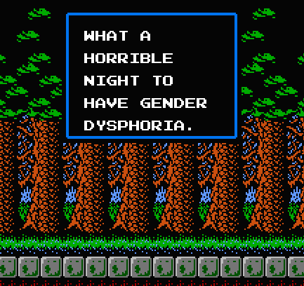
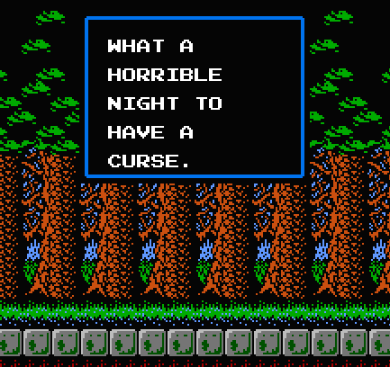
I was annoyed by the resizing/jpeging on this one, so I edited my own from the original
(the extra space between the D/Y is to match the R/I in HORRIBLE, the A/T in WHAT, etc. – the I, T, and Y in this font aren’t as wide as the other characters, but the font is set as monospaced, with those characters having their extra space on the left)
complete letter set via The Spriters Resource


